
Risk metrics
Portfolio Risk Metrics Explained: Drawdown, Volatility, and Sharpe Ratio
Last updated August 31, 2026
Volatility, drawdown, and the Sharpe ratio sound intimidating, but each answers a simple question about your money. Here is what the four risk metrics in Track your wealth mean — and how to read them across your whole portfolio.
The short answer
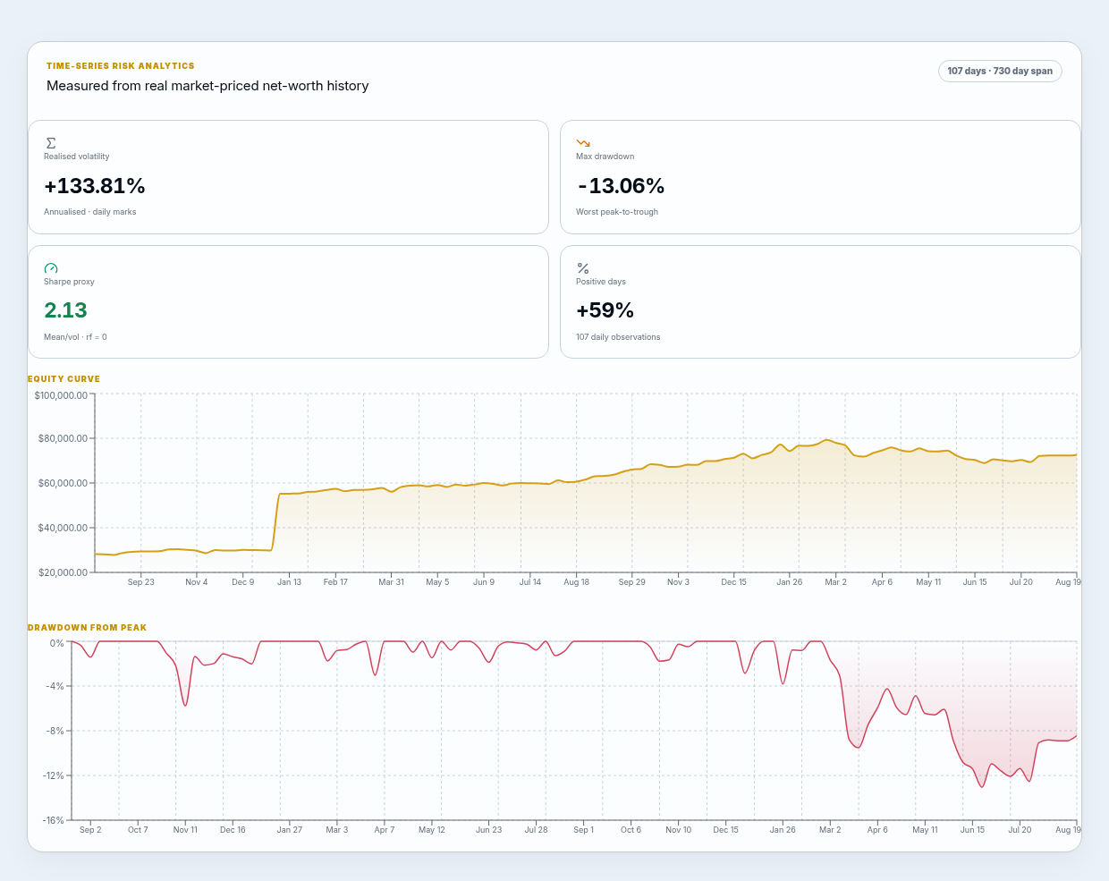
Returns tell you how much you made. Risk metrics tell you what you went through to get it — and whether you could have stomached the worst of it. Four numbers cover most of what a private investor needs: maximum drawdown, realised volatility, the Sharpe ratio, and the positive-day ratio.
Maximum drawdown
Maximum drawdown is the largest peak-to-trough fall your portfolio suffered over a period, measured as a percentage of the peak. It answers the question that actually keeps people up at night: how bad did it get?
How to read it
A -32% max drawdown means that, at the worst point, your portfolio was down 32% from its highest value. Lower is calmer. It is often more useful than volatility because it reflects the real loss you would have had to sit through.
Realised volatility
Realised volatility measures how much your portfolio's value fluctuates, usually annualised. It is computed from actual observed day-to-day changes — not a forecast. Higher volatility means a bumpier ride in both directions.
On its own, volatility is neither good nor bad: a portfolio can be volatile and still compound well. It becomes useful when you pair it with return — which is exactly what the Sharpe ratio does.
The Sharpe ratio (and why we call ours a 'proxy')
The Sharpe ratio is return per unit of risk: it takes your return above a risk-free rate and divides by volatility. A higher Sharpe ratio means you were paid more for the risk you took. As a rough guide, under 1 is modest, around 1–2 is solid, and above 2 is strong — but the exact number depends heavily on the period and inputs.
Why 'Sharpe proxy'
A textbook Sharpe ratio depends on assumptions (the risk-free rate, the sampling frequency, the return distribution). Because we compute it from your reconstructed history with pragmatic assumptions, we call ours a Sharpe proxy — directionally reliable for comparing periods and portfolios, not a certified fund statistic.
Positive-day ratio
The positive-day ratio is simply how often your portfolio finished a day up rather than down. It will not tell you the size of the moves, but it is an intuitive read on consistency — a portfolio that is green 58% of days feels very different from one that is green 51% of days.
Where the numbers come from
Track your wealth reconstructs your net-worth history from actual historical market prices applied to your holdings, rather than asking you to type in past balances. That means every risk metric above is measured from real market movement — so the analytics reflect what your specific mix of assets actually did.
A note on interpretation
Past performance and historical risk do not predict future results, and these metrics are analytics, not investment advice. Market data can be delayed or incomplete. Use them to understand your portfolio's character, not to make guarantees about it.
See it in the product
See the analytics in the productSee your whole net worth in one private view
Add property, gold, investments, cash, and crypto to one dashboard — valued live, with the analytics on this page built in.